Anyone running a blog or a website is quite familiar with the landing pages and how they help digital ventures gather relevant user information and make popular campaigns. From calling people to sign up for the mailing list to product or service promotions, landing pages help organizations in multiple ways to convert business.
The article covers 12 Mobile Landing Page Best Practices for businesses. But this also requires shaping the landing page specifically for mobile users as most people access the web now over the mobile screen. Remember, landing page design is something as important as the app development tips for a development company.
Table of Contents
12 Mobile Landing Page Best Practices
Just by clicking on a link, you can easily land on a landing page and can see how a product has been reviewed. But in case the linked page isn’t helpful, it can only make a negative impact on your user experience.
This is why the following good practices for a mobile landing page are so crucial. You can read this article https://bestlandingpages.software/kartra-vs-clickfunnels/ that offers a comprehensive comparison between two leading landing page design software tools. Read a comprehensive Kartra Review here.
If you don’t want to commit the same mistakes of many non-performing mobile app landing pages, here we can explain some useful tips and time-tested mobile landing page best practices to create killer mobile app landing pages.
1. Crisp and Clear Headlines
Since mobile users are always in a hurry and they don’t have much time to spend on a landing page, you need to grab their attention as quickly as possible. The faster attention-grabbing start basically with the use of visually attractive headlines with catchy and relevant phrases that instantly can connect users.
Before finalizing the headline, read it aloud to make sure it sounds right in the ear and instantly captures the attention of the audience. If the headline really takes longer than a few minutes for understanding, it is still not phrased perfectly. The headline should always allow effortless and easier understanding.
2. Convincing Call-To-Action
The second most important element in any mobile landing page design is the Call to Action (CTA) element. The CTA copy should be well articulated, impressive, short, and convincing to help business conversion.
The CTA should impel users to take positive actions or at least should make users think about this. Sometimes, just a straight and to the point, CTA can just do what is necessary. Some CTA phrases like “Avail the Offer”, “Get Started,” “Grab the Deal,” and the likes because if the straightforward approach can be highly effective for business conversion.
You must understand that the main goal of a landing page is to impel users to take decisive action and for this CTA copy and buttons are necessary. How can you ensure business conversion, if the CTA is not clearly visible or if it just doesn’t stand out visually from the surrounding? There should only be a single CTA button since you need to guide users to take one single action, not too many.
If headlines work correctly, then your call to action explains to your clients accurately what you want them to do.
Use the following secrets for your call to action buttons optimization:
- Always identify urgency. Suing such imperative words as “before 6 p. m.”, “now,” and “start today,” etc. will undoubtedly make people act immediately
- Locate your button in front and center
- Be maximum specific. Let your clients know what exactly happens when they click the button. For example:
“Watch the video now”
“Order the book now”
“Download the presentation in one click,” etc.
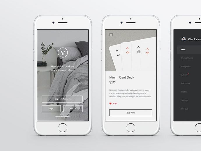
3. Minimal Clutter
Another major principle of a mobile landing page is to stay clear of the visual clutter that undermines the focus elements on the screen. For optimum mobile app landing page readability and user engagement, you need to ensure optimum visual clarity by using a lot of white space and a minimum number of on-page visual elements.
Since mobile screens are smaller in size, too many visual elements will only add to the clutter and create visual distractions. Moreover, to help business conversion also the mobile screen should allow users to find the CTA buttons and other key elements easily. This is why landing pages with a higher scope of business conversion always tend to be simple, stripped of the unnecessary clutter, and minimalist in look and feel.
4. Concise and Stripped-off Design
The landing page design should be concise and thoroughly stripped-off without allowing any visual clutter. From a very concise and to the point headline directly explaining your purpose to the use of a minimum amount of text above the fold, the landing page with limited use of text should help better clarity and purposiveness.
In this respect, the rule of thumb is that the deeper a visitor goes, the more detailed information is provided to him. You don’t need to inform the user about a lot of things at a step. But rather can disclose things and information progressively as the user advances. Too much information delivered at a certain point often creates cognitive overload leading to design clutter.
5. Know Your Audience`s Needs
One of the main rules while creating a landing page is to:
- Figure out your target audience
- Provide it with appropriate content
The problems start when you attract your clients to the landing page for mobile but cannot offer anything to them.
You should always remember that you must dismember such concepts as knowing your target audience and how to address your client correctly. Various social and age groups require entirely different approaches.
Always ask such questions as:
- Does my landing page provide info which only some categories of users consume?
- Does my landing page help solving their problems?
- I see that my target audience visits my mobile app landing page, but there is no conversion. Why is it happening? In this case, only additional research can help.
6. Understand Your Audience
Your client`s time and patience are always limited. You are the seller. They pay for your goods or services. But there is always an absolute limit to what they are ready to pay for.
So, how to determine how much is too much? Where to stop in your offerings? When you ask your client to take some action, always consider the following things:
- Put an average amount of information. Both too much and too little info can kill your landing page
- You should better use traditional templates for creating a landing page. Remember that not all people can easily get accustomed to innovations even if they are ground-breaking
- If you have no possibility to study your audience, address your landing page information to an average user
- Make as few pages as possible between your client and your goal. If there are too many pages describing what you offer, you will undoubtedly lose a half of the audience on the halfway.
7. Study Each Step of Landing page
Are all of them so important to deliver your offer? Divide all your pages into three main groups:
- Must-have. Leave this info unchanged.
- Should-have. Choose the most valuable information from this group. Only the vital facts and figures that your clients need to make a final decision.
- Nice-to-have. Delete the last category. Your clients will never reach it. Only if in some time your landing page converts well, you can add some issues from this group while constantly analyzing which of them lead to drop.
8. Improve Headlines
The headline is the first thing your visitor sees on your landing page. It must always grab a client attention and lead him to the final decision to click the necessary button.
However, even if your products or services are the best quality and your target audience will urgently need them, your headlines may scare them.
Just remember the following things which are vital for on all headlines of your landing page:
- Make your headlines exact and attractive. Your page must give you the best possible conversion rate – 100% is impossible for any landing page.
- Your headline should not contain your full offer. Use short and simple words to describe your proposal. Simplicity must be placed first.
- Your headlines must allow your clients understand what you want them to make further (make a purchase, subscribe to a newsletter, visit your presentation in New-York, etc.)
9. Keep Mobile Users in Mind
According to statistics, currently, every website will lose 60% of the audience if it has no mobile application for all types of gadgets. If your landing page appears wrong on mobile devices, you will miss clients.
So, make sure your landing page is readable on mobile devices because mobile users might be the core audience but you missed this fact. Check the action button placement and links. Are they easy to navigate with a finger? Thus, buttons must be large. Are photos shown correctly? All of this should be checked.
User-friendly mobile navigation is a must for a successful landing page.
10. Incorporate Short and Relevant Video
A mobile landing page for business conversion should make use of every available trick and method. For example, incorporating short and concise video with a catchy message can be highly effective along with the landing page text and CTA. All those restless users who dislike reading text or have become less responsive to text content can actually find an audiovisual clip with a straightforward message more interesting and engaging.
11. Simple Forms
Landing pages across the niches make use of forms to gather user information in a concise manner. But when signing up you make users fill up as many as 7 or 8 form fields, most users simply can avoid them and choose to navigate to elsewhere.
This is where a short and simple form with a minimum number of fields can be more helpful and engaging. The main objective should make users make up their minds instantly without much scope of pondering it later.
Apart from restricting the form fields to the most relevant categories of information, it is also useful to make use of social logins or guest logins to help faster completion of the process. Make sure you always ask the users for the most relevant information you need from them.
12. Visible Contact and Social Media Link
Landing pages also allow users to find the contact information and the social profiles of a business and so, you need to help them find such information without any difficulty or unease.
Since conventionally our eyes are trained to look for contact information on the top right corner of the screen, you should follow this convention when displaying the contact details. Apart from this, also provide all the social profile details of the business with easy-to-click icons right on the screen.
Mobile Landing Page Best Practices: Conclusion
So, cheer up! The considerable part of these problems with your landing page is not difficult to fix. However, the most complicated part is to diagnose them correctly before starting the right treatment. All you need to do is to know your clients and what they exactly need from either your product or service.
Certain secrets can save your landing page when things go wrong. We would better call them special techniques allowing protecting your landing page in case of some troubles.
Mobile landing pages now play a more crucial role in business conversion as most users and customers access the business content on the mobile screen. This is why you need to be uncompromising in providing visual clarity and maintaining the relevance of your mobile landing page.
- 12 Steps to Create a Killer Mobile Landing Page in 2020 - January 31, 2020