
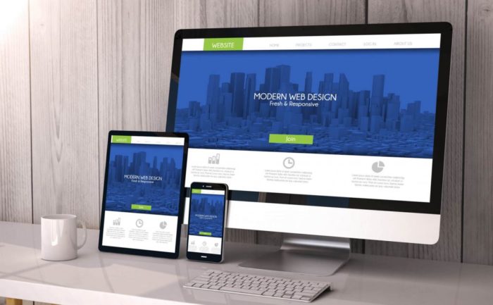
A responsive website is a form of Website design technique that makes the website adapt to the different screen sizes of the visitor’s viewing device. The primary objective of the responsive website is to provide an optimal viewing experience to the user no matter what type of device they are accessing the website. The blog covers 19 Essential Benefits of Responsive Web Design. Let’s start with the obvious Responsive Web Design benefits in 2020.
Table of Contents
History of Responsive Websites
Back then late ’90s and early 20’s one of the biggest issues with regular websites is the developers have to develop multiple versions of the website that adapts to different screen sizes. Thus it makes it harder to maintain each website with the progress in technology.
In order to solve this issue the concept of the responsive website was introduced, In fact, the first Responsive website was developed in 2002 by Audi.com
. However the concept has been termed as fluid website, elastic website and flexible website etc, it was not until 2010, that Ethan Marcotte, an independent web developer who also wrote a book on responsive web design, formally coined the term responsive design.
Since then, the advancement of mobile technology has made a responsive website to become an integral part of every business today.
Why does Responsive Website matter?
A responsive website has been a major talk in the business sector in recent days among the top branding companies. No matter the size of the business whether small are big everyone is working on a Responsive strategy. In order to explain the importance of responsiveness let’s start with the obvious mobile technology development. We are living in the Smartphone era where everything you need is right in your pocket.
Having a responsive and engaging website is one of the most prominent requirements of a Good Website Design. In 2020, responsive websites have become so common that by default if you reach out to an agency to create a website, the assumption is that it is going to be responsive in some degree or the other.
It does not have to be a full-fledged eCommerce site in order to be responsive. Simple brand websites too can have enhanced experiences by having little responsive elements embedded in the website design.
A Recent report in 2019 stated around 4.39 billion of the total world population are using the internet to find their requirements out of that 3.99 billion people are accessing the internet through Smartphones.
As the number speaks it all, it is obvious to know to say why most of the companies are switching their strategy to mobile-friendly websites. In this mobile era, a company that fails to cater to the mobile user can consider themselves dead.
If you are still not yet convinced? Here are some more statistics that will support our notion of the benefits of responsive web design:
Well, that is all to say it is clearly evident that there is a surge in the number of mobile users every year. Therefore it is important to have a website that is mobile-friendly which adapts to different screen sizes.
19 Business Benefits of Responsive Website Design
Apart from this, there are quite a few advantages responsive websites have in their sleeves. Here in this article, I going to bring forward some of the benefits of responsive web design:
1. Drives More Traffic
Among the many advantages of responsive websites, improved traffic is the major one. According to the recent report of Statista shows the second quarter of 2019, approximately 48.91 % of traffic comes through Mobiles.
It shows that more than half the percentage of traffic is originated from mobile devices. Therefore, if you wanted to enhance your business it is increasingly important to have a mobile responsive website that can fit all types of screen sizes.
2. Cost-Efficient and less- Maintenance
A responsive website is cost-efficient as it reduces the investment and maintenance of the developing individual website for each device with different screen sizes.
For instance having two separate websites of mobile and desktop you need to have two different sets of marketing strategies, two set development teams, and two sets of admin panels (Especially for an e-commerce website).
Thus it requires double investment and maintenance. With a Responsive website approach, a responsive website is less of a headache and also helps to concentrate the single website to improvise the business.
3. Enhances the User Experience
A responsive website can help to increase the user experience. One of the primary factors which determine the quality of the website is the user experience on the website. About 88% of the user not likely to return to the website after the bad user experience.
This shows if the user feels like the website is not user-friendly and they are always forced to pinch-zoom in and zoom out they most likely won’t stay on the website.
However, if the website is responsive it can be viewed across any device and screens, therefore, users can browse through the website without any problem. Thus increase the stay time user on the website.
4. Less Bounce Rate
If your website is slow and sloppy there is higher chance you will lose your potential audience! However, if the website is responsive and it is compatible with the all the screen sizes most likely user will stick to your website for a long period of time which result in a low bounce rate.
5. Increase in Lead and Conversion Rate
High User experience and Lower bounce rate can increase the conversation rate. Unfortunately, it only does its job at 50%. If the website is not responsive and every time the user redirects to a device-specific website to access your services than possibly your visitor will lose interest in services. Having a responsive website can improve the lead and conversion rate.
6. Improves SEO
As I mentioned above in 2105, Google stated that the Website which is mobile friendly can have increased ranking. And also we all aware of the Google penalties website for various factor one of the main factors are duplicate content. Have 2 or 3 device-specific websites with the same content might lead to the Google penalty.
Responsive reduce the effort of the link building, Link building is considered to be one of the important factors for many SEO experts. Having two or more websites can lead to less focus on the website and also confuse the user on which page they are landing.
7. Increases Conversion Rate
By going from a mobile-friendly version to a responsive website you are more likely to boost earnings or conversions from advertisements. Increasing your conversion rate or earnings by switching your website to responsive design is simple business sense.
Migrating simple website design to responsive design resulted in 10-30% increase in simple web design earnings compared to mobile-friendly versions.
8. Higher Ranks in Google (SEO)
Responsive Web Design means higher rankings in Google search. If you make a website then to be found on Google, receive more traffic and leads will be your priority. This priority is a must for any small and big business owner.
If your website has only one responsive design then you don’t need an additional version of your website that’s made for mobile devices. With just one strategic URL you can strengthen your SEO. Don’t build a separate website design for tablets, iPhones, desktops & laptops as that is now a thing of the past.
9. Increases Reach to Tablet and Mobile
Increasing use of the internet and explosion of web applications on mobile and tablet and has been the driving force behind Responsive Web Design.
Traditionally users would be re-directed to a device-specific site but, Responsive Web Design means one site can be implemented across devices. Tablet sales are expected to exceed 90 million this year; it means that Responsive Web Design has never been so essential for those looking to optimize their online content.
Certainly, some sites are already experiencing up to 30% traffic from tablet and mobile devices and this is profitable very important to accommodate the lesser display size in a cohesive design.
10. Your Customers are Already Mobile
Most likely if you ensure your analytics then you will get that already 20 –30% of your clients are coming from mobile or tablets and if you are not offering them a user-friendly website then you are losing your clients.
Therefore, the additional advantage of responsive web design is that it will allow you to keep in touch with your clients as well as engage with them on every possible event.
11. Saves Time and Cost
Customers will find it easier & less time-consuming to maintain a single website with less content to handle.
In addition, a single organizational interface can easily be optimized by using workflow tools and layout to manage the correct content or website templates that are being used for different devices. Business logic can be applied such that the overall multi-device experience can be significantly enhanced within a single administration, like Blaze CMS.
12. Google Loves Responsive Websites
In spite of the availability of search engines, Google is used by most people around the world.
So, the majority of the entrepreneurs involved in the web-based business, emphasize their site’s performance in Google’s SERP to earn a handsome income every week/month. Google cares a lot about its users. That is why it recommends website owners have a responsive site design.
It helps Google to pick the most relevant and responsive web pages/sites and display them in its results. In case, your site doesn’t perform well on different mobile devices, Google will downgrade its ranking sooner or later.
This will affect the visibility of your site on the world wide web and you start to suffer the loss in your web-based business little by little.
13. Rapid Use of Mobile/Tablet Usage
Just move out of your house/office and look around your locality. You observe one important thing- Everyone is engaged with his/her mobile devices and surfing the net. As a matter of fact, the percentage of mobile and tablet Internet users is increasing with each passing day.
The proliferation of web applications on different mobile devices has made it essential for business organizations to take their web-based businesses to the mobile platform if they want to survive the cut-throat competition and survive in the business for a long duration of time.
For example- If you operate a WordPress site, you can easily take it to the mobile platform using a WordPress plugin to increase its clout. If you are a novice, you can use a responsive website builder, this will cut off a lot of work. It does not require any additional plugins or coding knowledge and just in a matter of hours you can have yourself a perfectly designed responsive website.
14. Faster Loading Speed
Whenever you create a website, you should build it with the “mobile user first” approach in mind. It helps you to add only the necessary design elements to your site and make it faster.
Always keep in mind that visitors like to browse faster websites so that they can find the desired information easily and quickly. If your website is slow, it will frustrate them, and they will flock to other similar websites.
A responsive website quickly loads on all devices and provides the best user experience for visitors. It helps entrepreneurs to make visitors loyal to their brand and seek new potential customers so that they can generate sufficient business opportunities.
15. Improved Localized Search Results
Localization is the process of making the necessary changes in a website to meet the needs of linguistically and culturally different audiences. Localized search results matter a lot for the companies and service providers in the customer service outsourcing domain.
It involves the translation of your website content and layout into different languages. As there are several benefits of website localization, entrepreneurs always make additional efforts to optimize their site for localized results.
But, always keep in mind that Google always prefers mobile optimized and responsive sites when it has to show the localized search results in different geographical locations of the world. This can help you to get more business opportunities from international clients and customers.
16. Increased Output Of SEO Activities
In order to increase the visibility of websites on the World Wide Web, SEO professionals optimize them with different SEO tricks. As a site’s responsiveness is a key factor for a site’s ranking on Google, all your optimization efforts are futile if your site is not responsive.
If you make your site responsive to all mobile devices, Google will find and add it or its pages in its search results prominently. It also improves the outcome of your SEO efforts up to a great extent and you get its financial benefits sooner or later.
17. Lower Bounce Rate
The bounce rate is an indicator of the usability of your website. It measures the total number of people who landed on your site and go away instantly after visiting just one page.
If your website has a high bounce rate, Google may consider it irrelevant for visitors and not add it in its search results. On the other hand, if your site is responsive to all mobile devices, users will definitely love to visit it and spend some time.
This reduces the overall bounce rate of the site and you get its business benefits in terms of more subscribers, leads, and conversions.
18. Easier To Maintain And Operate
If your mobile website is totally different to the main website, you have to update them separately at regular intervals. For this, you have to put more people at work, which is the complete wastage of your valuable resources.
If your website is responsive, you can maintain and update it easily and quickly with a little investment of resources. Thus, you can use your valuable resources to better the other aspects of your web-based business and increase the overall ROI up to a great extent.
19. Enhanced User-Experience
It is said that “Your first impression is the last impression”. The same principle applies to a web-based business. As a matter of fact, websites are a medium to share the web content with the targeted audience and sell products/services to them.
If your website is user-friendly, visitors can easily find on the web, use it for their specific purposes, and suggest others to use it as well.
As user experience is a huge ranking factor in Google, you can make visitors loyal to your brand by adopting the right theme for your website. It enhances the user experience up to a great extent and you get more chances to do business.
Essential Benefits of Responsive Web Design: Conclusion
Smartphone users are increasing day by day so does the business. In order to survive in a competitive world, one must adapt to growing customer needs. If you are website is still not responsive and outdated it’s time to take a step towards responsive.
Modern Internet users are fond of responsive websites. They are more likely to browse websites through different mobile devices and expect a smooth desktop experience.
The above-mentioned points highlight the importance of RWD for the enhancement of web-based businesses. Just adopt them and take your business to the next level quickly and easily. Thank you for reading the benefits of responsive web design, do tell us your opinion in the comment box below.
- 19 Essential Benefits of Responsive Web Design - October 18, 2019