In the graphic design process, every designer must master creating a visual order. The visual order can also be understood as levels and is a necessary part of the design. Whether you’re designing a poster or a webpage, you must consider how each needs to look visually to a general audience. Because of visual changes, the levels are more layered overall.
Table of Contents
How to Create High-level Visual Works?
From a general point of view, as a designer, when a user browses a webpage with a lot of information, even if the user is simply looking around, the visual elements should still leave an impression that the user will remember later.
These are the primary visual elements, and secondary elements are those that can only be remembered when the user is looking more carefully. From a more intimate point of view, it is necessary to form an order of visuals. How many ways should you draw attention to a design’s visual order? Here are some commonly used techniques for breaking through the layout.
1. Comparing sizes
One thing to remember is that everyone has their own habits when browsing things, such as: viewing from top to bottom, from left to right, which is conventional. However, a designer can’t be limited what’s conventional.
A completely traditional routine that does nothing but makes designs boring and dull. That means it’s crucial to learn to use what you know about design to create different visual sequences and evoke a stronger sense of design and layering.
For all the different ways you can create visual order, contrasting sizes seems like the only and simplest form that everyone can think of, as such:
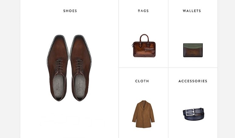
The visual focus can be intuitively incited by contrasting sizes, which is also the most acceptable form of design. It is precise because of the processing method of this enlarged product that shows both contrast and a flexible layout. This form is very practical in a more text-based layout, on posters, and on web pages. even in composite design.
If you’re an Amazon self-employed who lacks design skills and can’t afford professional graphic design tools, but you’ve always wanted the opportunity to make sales posters easily.
Maybe you can use Fotor Graphic Design Maker, which has a lot of graphic design templates. No matter what types of templates you need, Fotor can completely satisfy you. After entering the keywords you want, take a quick look and you will be surprised to find many templates you like.
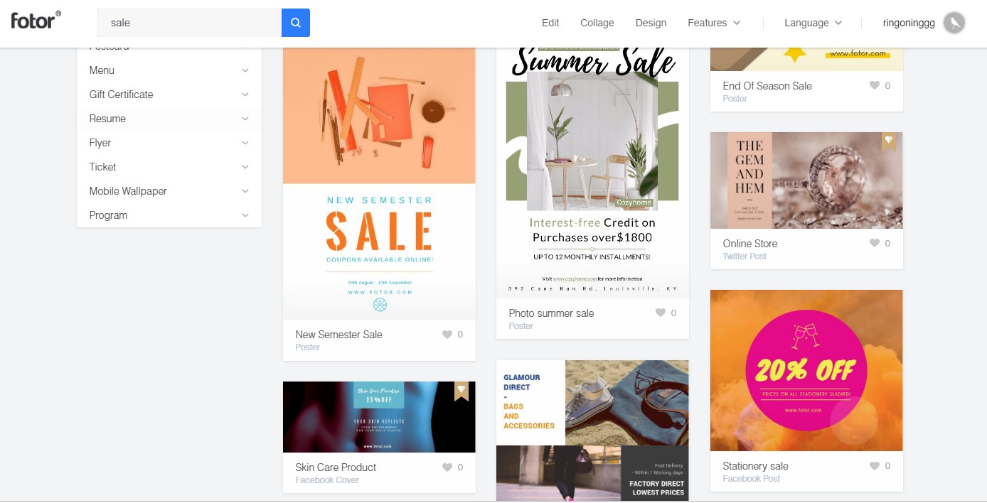
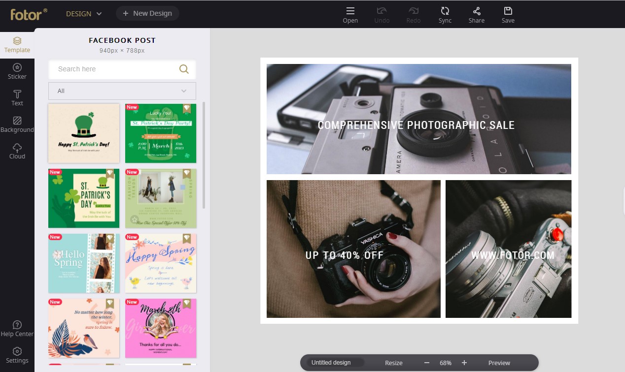
For example, I chose this Online Photography Sale Template which is a good fit for me. Then I spent a few minutes making some further changes, such as color, background, text, etc. When finishing all the edits, simply click the Save bottom on the top toolbar to download it. Now you have a brand new poster to market your products for your sales campaign!
2. Matching colors
It is also possible to create changes in visual level by altering the method of color matching, like our common method of distinguishing between colored and achromatic:

The addition of color to the original achromatic arrangement creates a strong visual differentiation, and due to this strong difference, that part draws users’ eyes.
At the same time, it forms a sequence of visuals, and this difference can also play a role in breaking up the layout and activating it. Between colored objects, it is also possible to form a visual order through differentiation, such as:
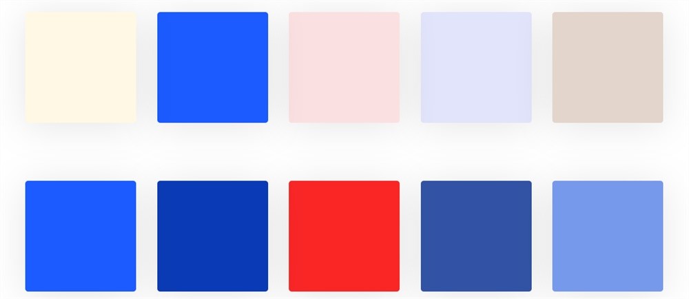
The second one on the first row of color blocks can attract attention thanks to the differences in saturation, and the audience can easily detect how the visuals have changed, which further changes the habitual visual order from left to right.
The red blocks on the second row are noticed the most quickly because the form that creates the visual order is changing the color system. The most important thing about reflecting the visual level in colored objects is that the difference between them is obvious enough.
3. Differences in shapes
One of the most important aspects when creating a different visual order is to look for differences in the natural order compared to what are normal habits. Then we can also use morphological changes as a form of differentiation, such as:
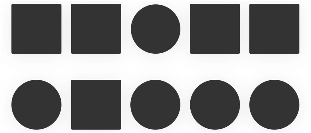
Look for the elements that can cause differentiation intrinsically, and the elements can be divided into two kinds in terms of visual perception: First, changing the original habitual reading mode, and also changing the overall primary and secondary; second, The change in the elemental form played a role in changing the boring and repetitive structure, breaking up the overall layout.
This makes the overall layout appear more varied, more layered, and more active. The morphological changes can also be reflected as follows:
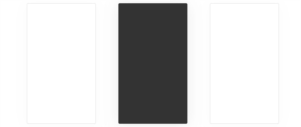
Although they are all rectangular wireframes, there are obvious differences between the wireframes and color blocks. They also reflect the visual hierarchy, which is common in many pages:
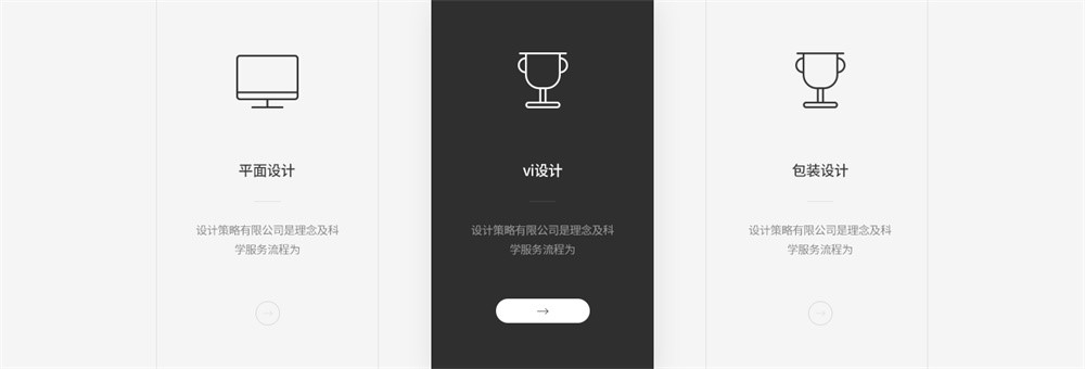

This is also an important part of layout design: finding elements that can break up the layout and create visual levels. It is precise because of these methods that the layout is richer and more morphable.
4. Blank spaces
When it isn’t required to change a lot, the different visual order can be created by changing where spaces are or the way you leave parts blanks based on the original. For example:
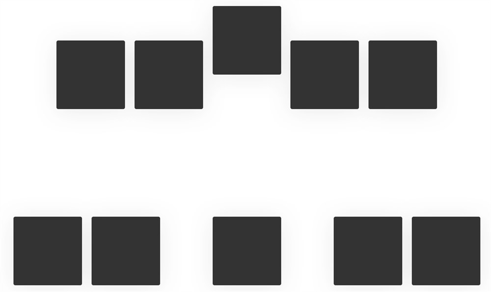
Even though these blocks are the same size, color, and shape, the different spaces in between change the visual order.
5. Way to project
Projection is a very common method when designing. Projection can reflect the front and back levels, and can also change the visual order, like page design:
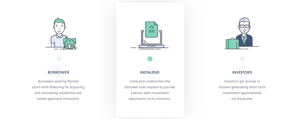
Here just add a simple projection effect to the color block, and the original visual order is instantly rearranged. The most commonly used way to project in poster design is to break the relation between the front and back, adding even more layers to the poster:
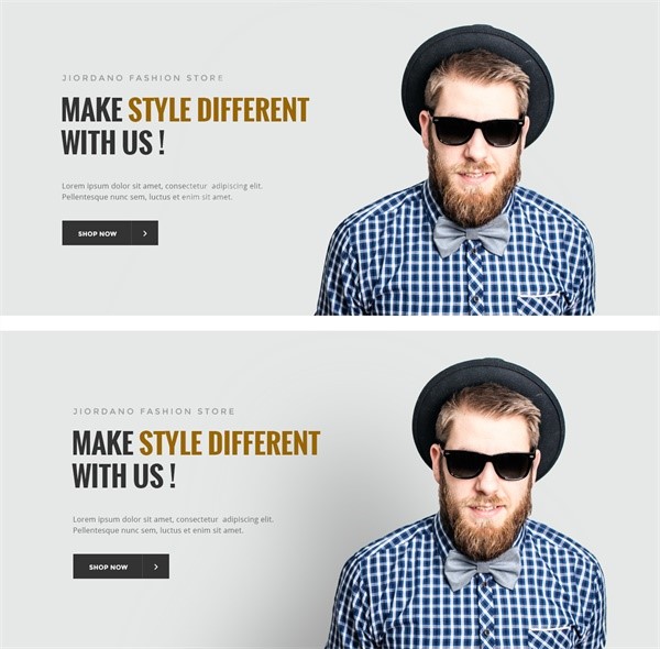
This kind of large projection is one of the commonly used techniques in many posters and pages. Because of projection, the entire picture appears to have a clear hierarchical relationship.
The user gladly accepts the project, especially buttons, the subject, and more. These small changes can often bring significant results to the page. This form can also be understood as forming an occlusion relationship, which is very practical when designing some small scenes:
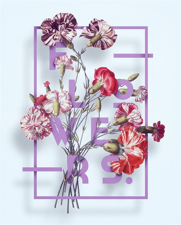
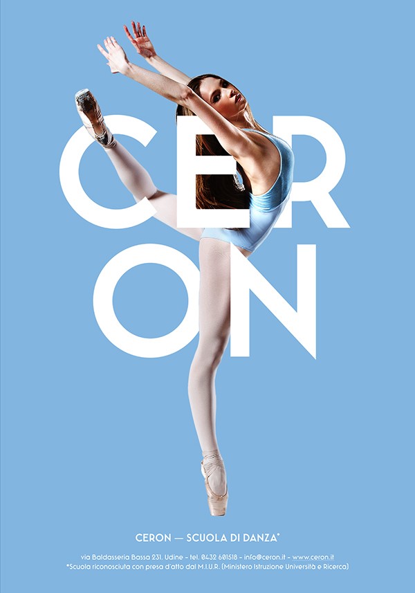
The visual hierarchy will be formed with an occlusion relationship. Although this technique seems simple, its effect is remarkable when put into place.
6. Gaussian Blur
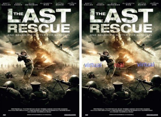
Another way to reflect visual order is using blur, and many are quite familiar with blur tools in Photoshop, and visuals can be leveled created by blurring visual elements, such as movie posters:
Changes in visual hierarchy are stronger when contrasting between virtual and real, which is one of the commonly used techniques in composite design. This method can also define the visual order relationship in text design, such as:
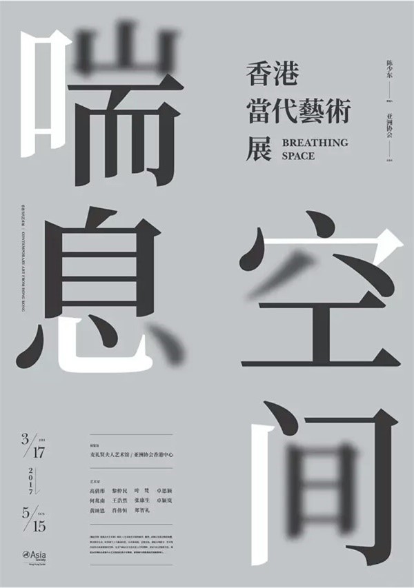
By blurring a stroke in a font, a certain spatial relationship is visually formed, which also makes the overall layering richer. This is why many designers like to add some blurred elements in the final piece of their work to enrich the entire composition:
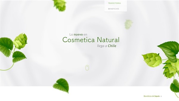
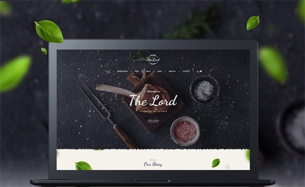
Changes in the visual hierarchy are an integral part of the whole, and sometimes it takes only a small change to bring unexpected results.
7. Applying to the layout
Many issues mentioned in this article are mostly changes in the details, but many people aren’t too aware of them. In fact, the excellent layout design is primarily built up by different ways of handling details.
If your layout is too rigid, you can break it up in the right places by considering these aspects. Breaking it up means looking for how to change the visual hierarchy when it’s more rigid, making the overall layout active and detailed, such as:
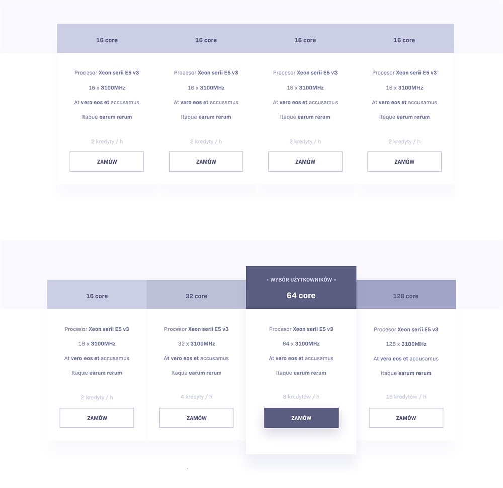
This is partial information selected from a page. The top layout feels rigid. If a large layout that looks like this appears on the page, its entirety will be monotonous and boring, and it is easy for it to form visual fatigue. The lower area has changed drastically to avoid that rigidly.
We can find some pages with strong typographical features on the Internet and analyze how these methods are reflected in the layout.
For example, some official website designs seem to be very simple and have few elements, but often these pages are even more dependent on the layout because they need to reflect layout changes and levels with very few elements.
In summary:
Visual layering is a very important method of enhancing the overall design sense. Methods to break the restriction on the inherent visual basis and looking for change is crucial for every designer.
Many design techniques have commonality, as long as we learn to use it flexibly, our design works will appear extraordinary.
- What is Epic Games Launcher and How to Install It? - July 15, 2024
- What Is Audius Music Streaming App and How Does it Work? - July 13, 2024
- The 10 Best Astronomy Apps for Stargazing - July 12, 2024
